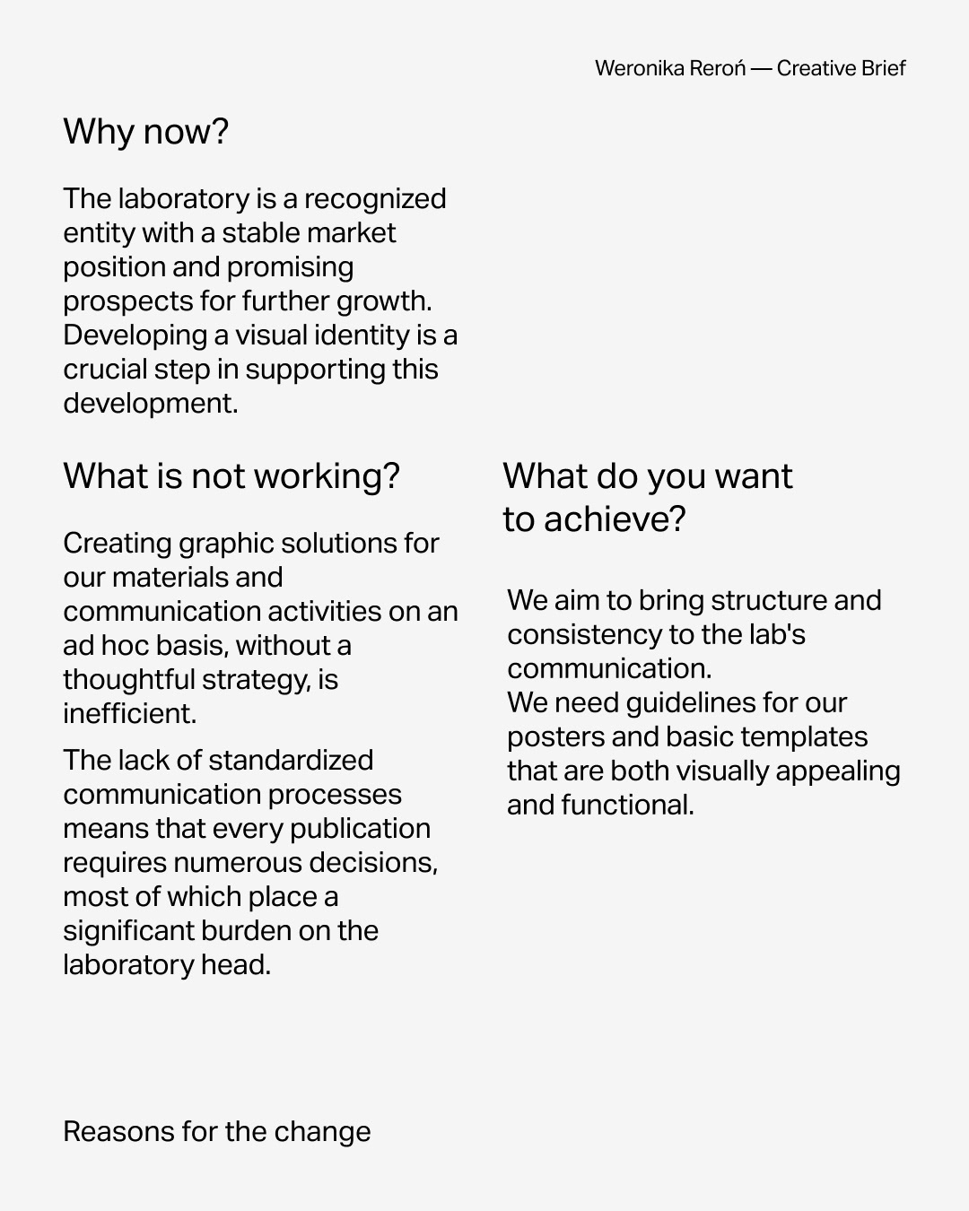
While it might seem that the logo is at the heart of visual identity, the truth is—it’s not enough on its own. Even the most beautiful mark won’t create a cohesive brand if it isn’t supported by a well-thought-out communication strategy and a clear vision of who we’re speaking to and how we want to present ourselves.
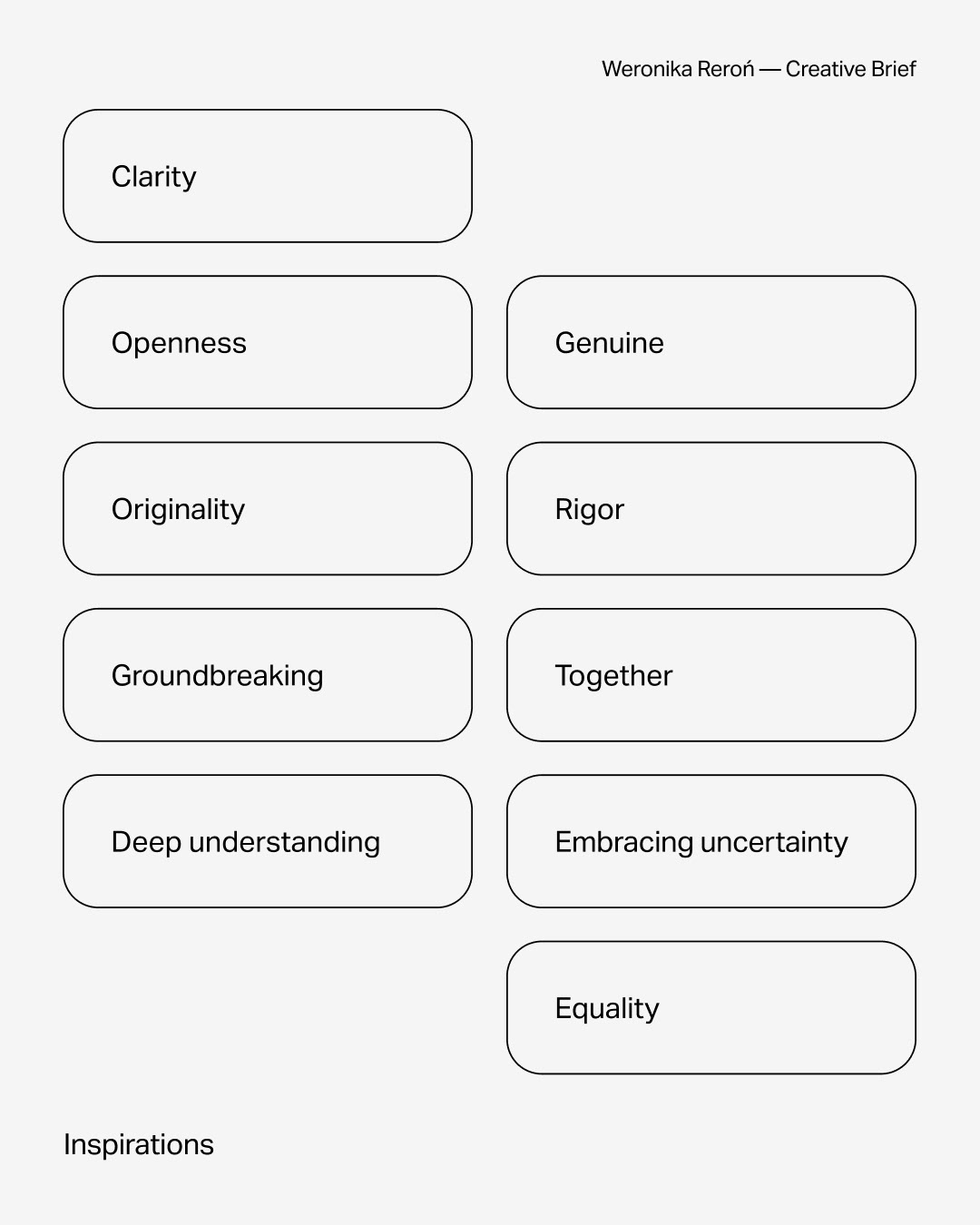
That’s why I begin every project with in-depth research. I talk to the client about their goals, expectations, the specifics of their business, and the competitive landscape. Together, we define the target audience groups and the core values the brand should represent. All this information is compiled into a strategic document—a compass for the creative phase that follows.
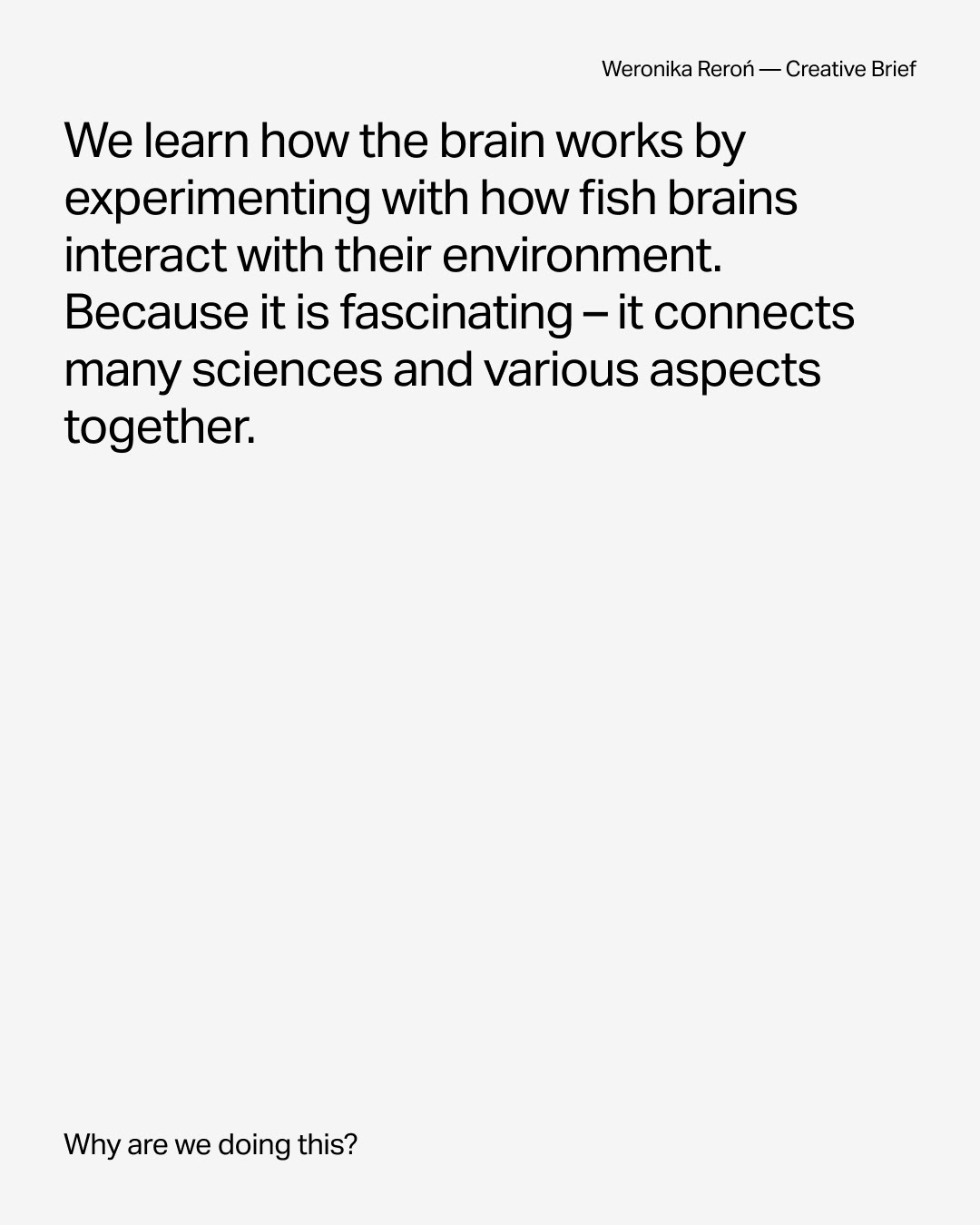
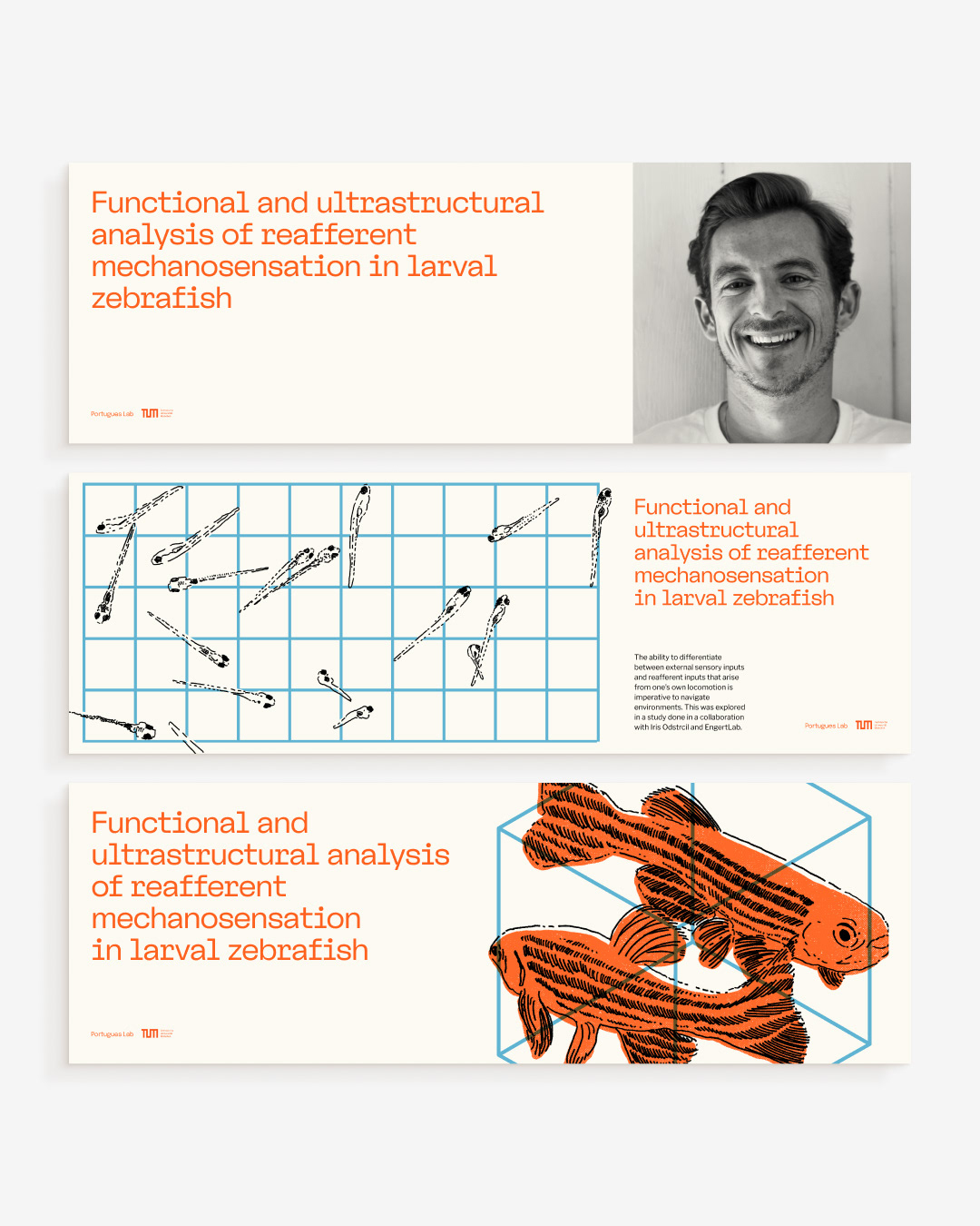
This is the part I enjoy the most—diving deep into the subject matter, discovering its nuances, and realizing how fascinating even a seemingly “ordinary” industry can be. From that understanding, the visual design starts to emerge—but more on that in the next part of the case study.
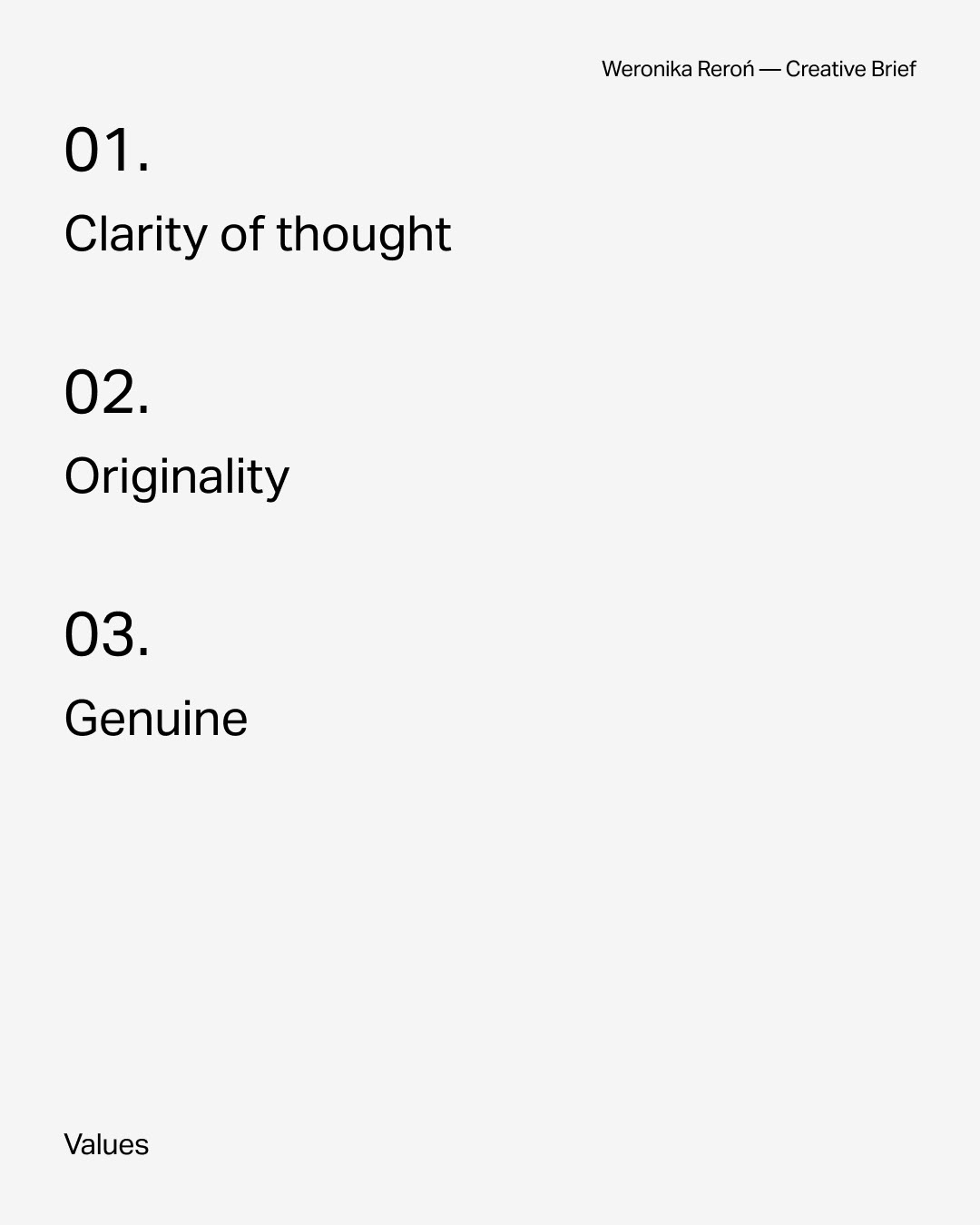
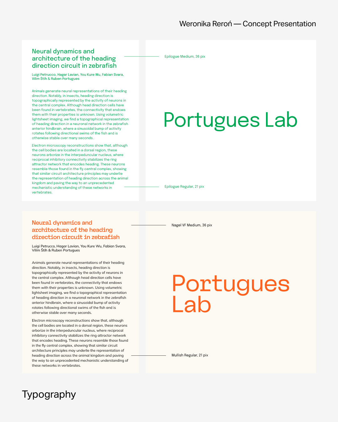
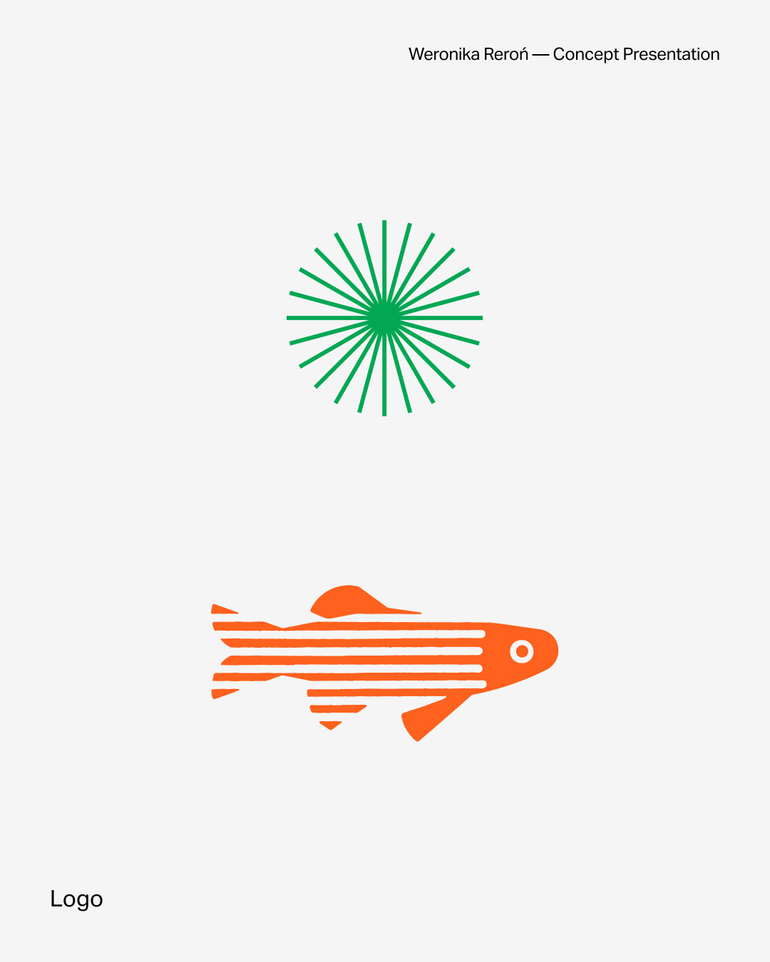
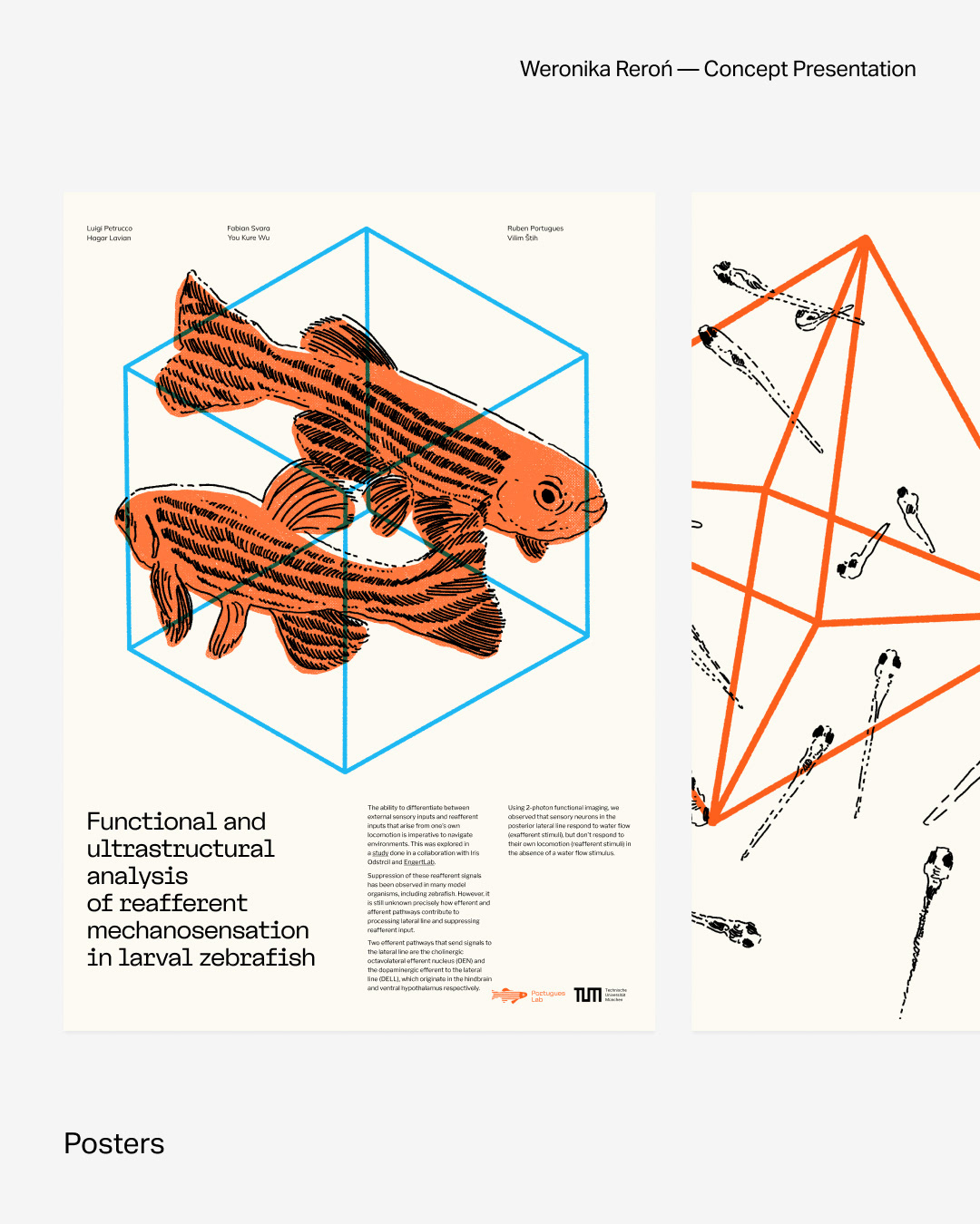
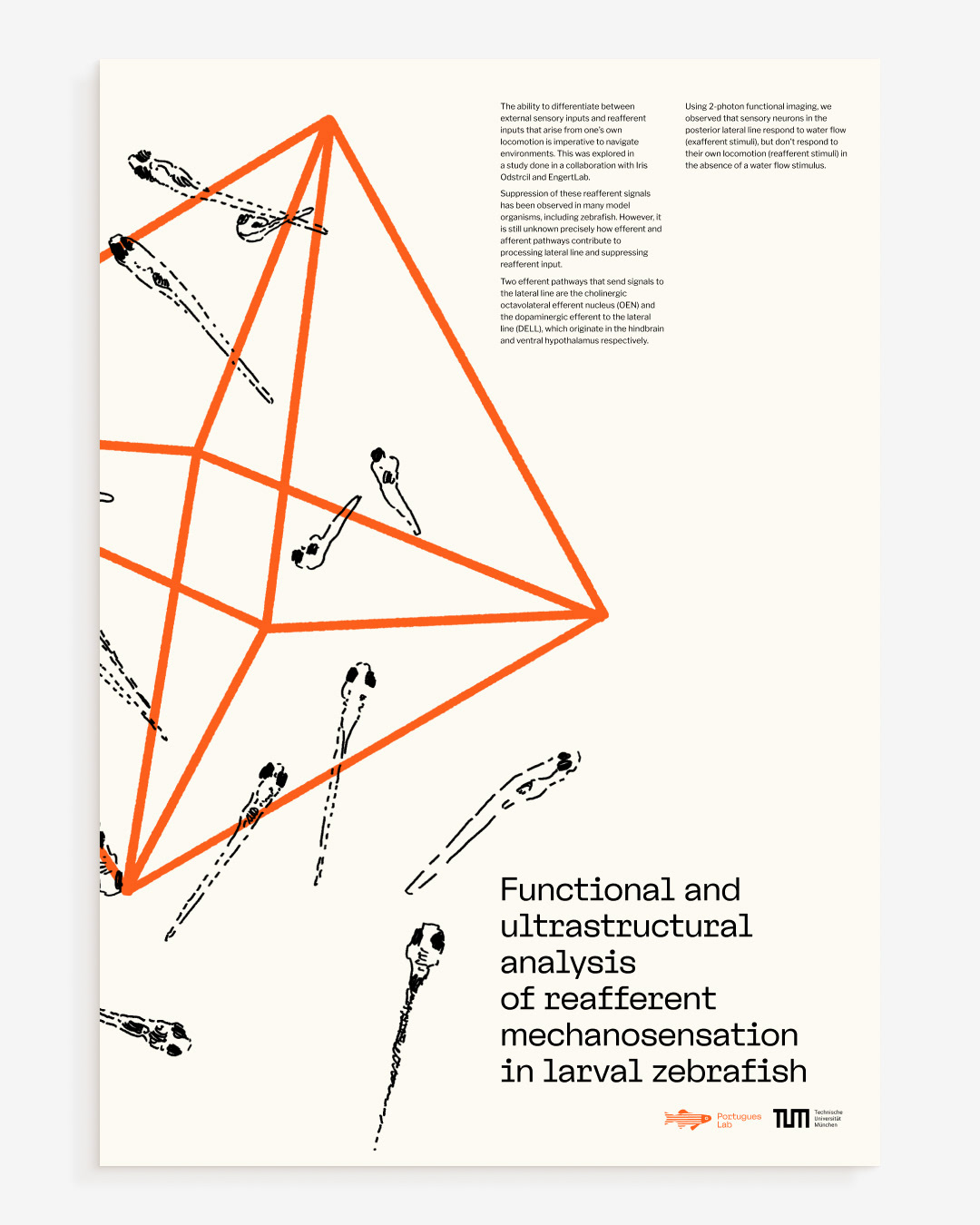
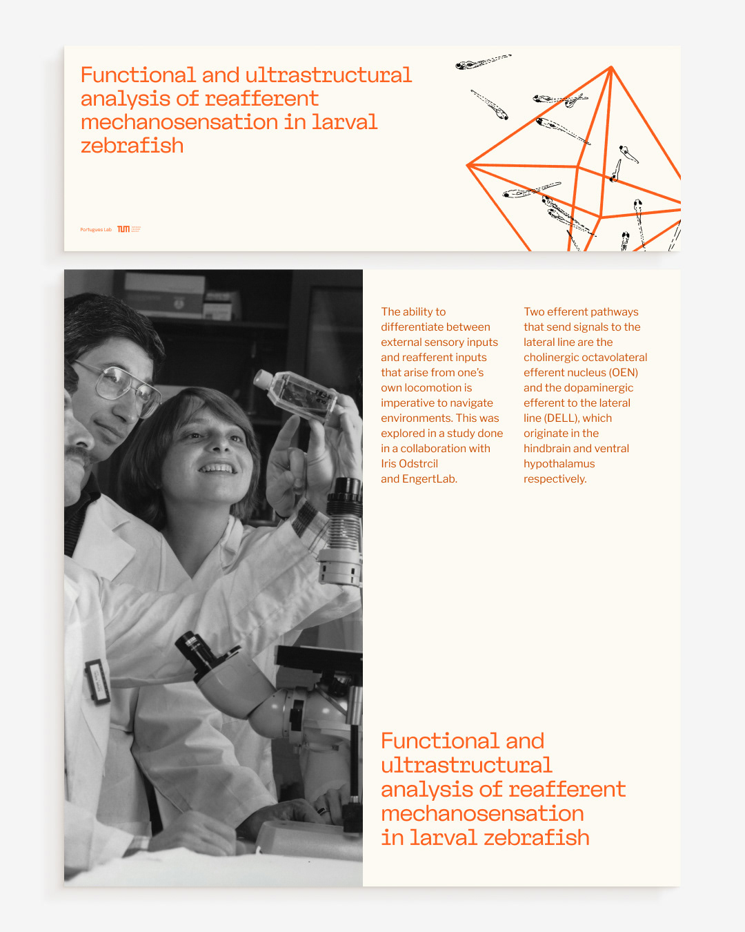
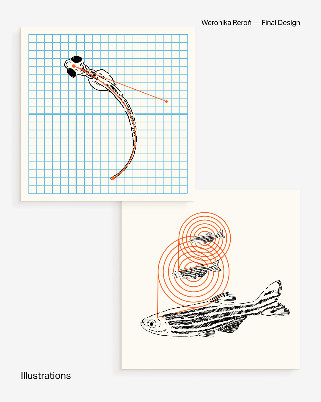
So, if not the logo, then what defines a brand visually? In my opinion: color palette, typography, layouts, and the overall illustration style—whether it’s photos, icons, or drawings. These elements form the foundation for most of the brand’s visual materials and shape how it is perceived on a daily basis.